Architecture websites that make the work the hero
SimpliTechPro builds custom websites for architecture and design studios, image-forward, with filterable project galleries and immersive case studies that let the buildings speak. The build below, Verrow, is a live concept demo you can explore.
Verrow
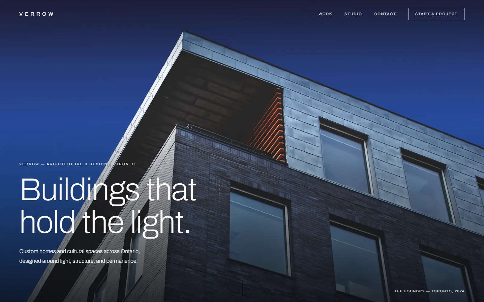
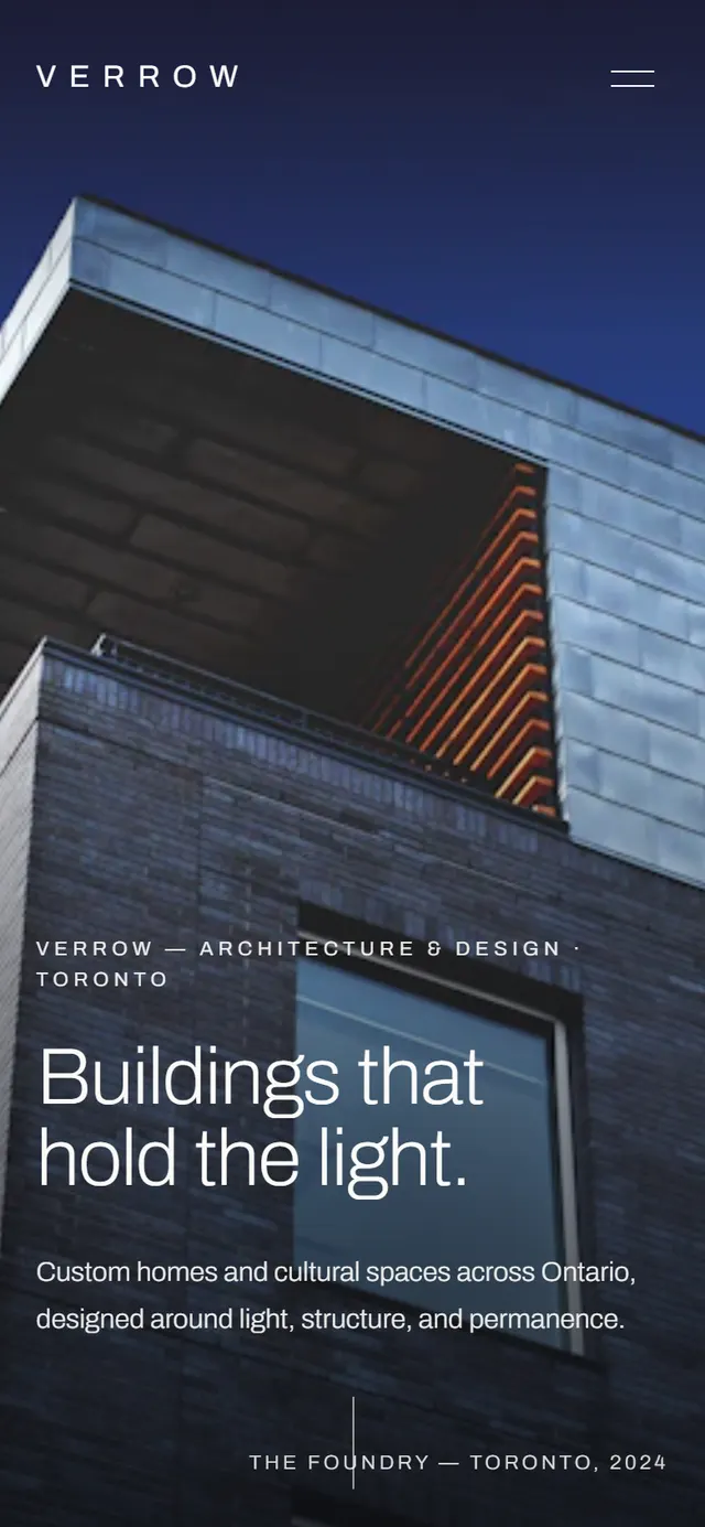
Built as a Simplified package buildAn architecture studio sells taste and judgment, so its website has one job: prove both before a word is read. This demonstration build is a cinematic, image-forward editorial site for a fictional Toronto studio, near-monochrome bone and graphite, one deep ink-blue accent, light wide-tracked type against huge architectural photography.
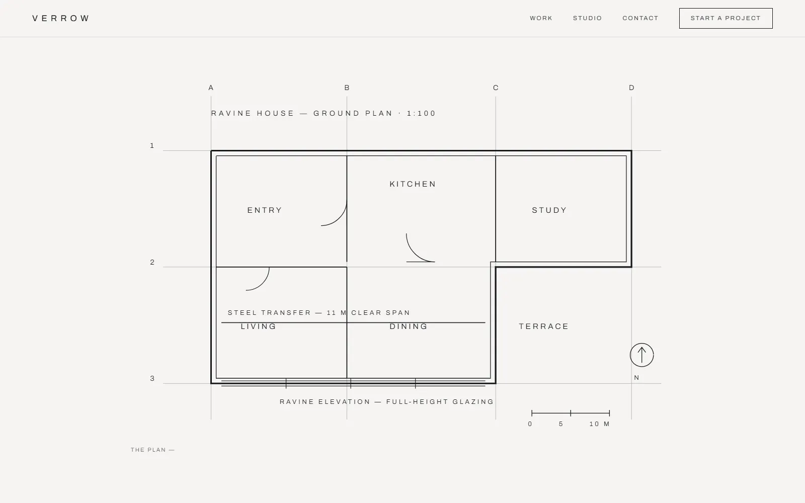
Its signature is the plan-to-photo reveal: on each project case study, a hand-built architectural drawing, a ground plan with grid references and door swings, a cross-section with its light rays, draws itself line by line as you scroll, holds, then dissolves into the photograph of the finished building. The drawing becomes the architecture. It is built with no animation libraries at all, and it degrades gracefully to a still image for reduced-motion visitors.
Around the signature sits a complete studio site: a filterable index of selected works, immersive case-study pages that read like an architecture journal, a studio page describing the practice's method, and a considered project-enquiry flow (demo-labelled, nothing is sent). It is the top of the design ceiling for a marketing site, and deliberately built without an app layer, to show how far pure design craft carries the entry tier.
What the build shows
The plan-to-photo reveal
Hand-built SVG architectural drawings draw themselves on scroll, then dissolve into the finished building's photograph, the studio's process, told in one scroll.
Cinematic editorial design
Bone, graphite, and one ink-blue accent under huge architectural photography, restraint as the design statement.
A filterable work index
Selected works filter instantly by type, residential, cultural, civic, with no page reloads.
Immersive case-study pages
Full-bleed image sequences with narrative and project specifications, paced like an architecture journal.
An editorial type system
Light, wide-tracked sans for structure; a quiet serif for narrative, typography that reads as taste.
Accessible by design
AA-verified contrast over every photograph and a static fallback for reduced-motion visitors, craft that includes everyone.
What we integrated and automated
What we integrated
- A filterable selected-works index
- Immersive case studies with the plan-to-photo signature reveal
- A studio/method page that positions the practice
- A considered project-enquiry flow (demo-labelled)
What we automated
- The enquiry is captured and structured for the studio (demo, nothing is sent)
- The signature reveal, filters, and reveals all run on hand-written code, no libraries, nothing to license or maintain
A look at the site
Explore it live. Then imagine yours.
The demo is fully interactive, open it, scroll a case study, and watch the plan draw itself and dissolve into the building. If this is the standard of craft you want for your studio, the next step is a conversation.
The demo opens in a new tab. The enquiry form on it is clearly marked demo, nothing is sent.